
[Matplotlib] Matplotlib 개요
Matplotlib 개요
Matplotlib 은 파이썬에서 데이터를 그래프나 차트로 시각화할 수 있는 라이브러리이다.
그래프 그려보기
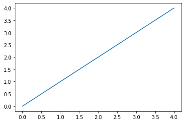
import matplotlib.pyplot as plt
import numpy as np

x = np.arange(5)
y = np.arange(5)

plt.plot(x, y)
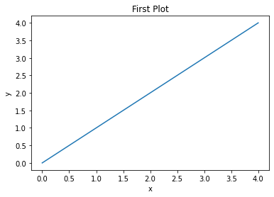
import matplotlib.pyplot as plt
import numpy as np

x = np.arange(5)
y = np.arange(5)

plt.plot(x, y)
plt.title("First Plot")
plt.xlabel("x")
plt.ylabel("y")
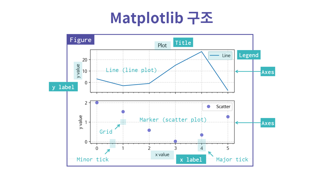
Matplotlib 구조
Matplotlib 구조는 아래와 같다.
저장하기
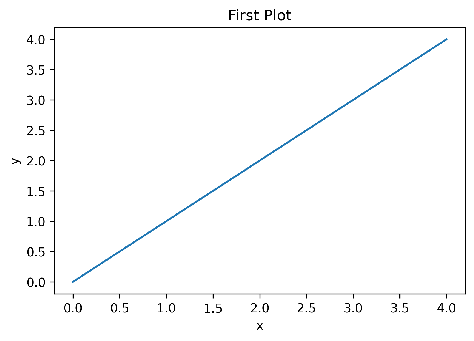
import matplotlib.pyplot as plt
import numpy as np

x = np.arange(5)
y = np.arange(5)

fig, ax = plt.subplots()
ax.plot(x, y)
ax.set_title("First Plot")
ax.set_xlabel("x")
ax.set_ylabel("y")

fig.set_dpi(300)
fig.savefig("/_img/2022-08-16/graph03.png")
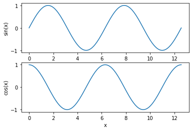
그래프 여러 개 그리기
import numpy as np
import matplotlib.pyplot as plt

x = np.linspace(0, np.pi * 4, 100)

fig, axes = plt.subplots(2, 1)

axes[0].plot(x, np.sin(x))
axes[0].set_xlabel("x")
axes[0].set_ylabel("sin(x)")

axes[1].plot(x, np.cos(x))
axes[1].set_xlabel("x")
axes[1].set_ylabel("cos(x)")
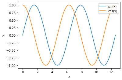
import numpy as np
import matplotlib.pyplot as plt

x = np.linspace(0, np.pi * 4, 100)

fig, axes = plt.subplots()

axes.plot(x, np.sin(x), label="sin(x)")
axes.plot(x, np.cos(x), label="cos(x)")
axes.set_xlabel("x")
axes.set_ylabel("y")
axes.legend(loc="upper right")
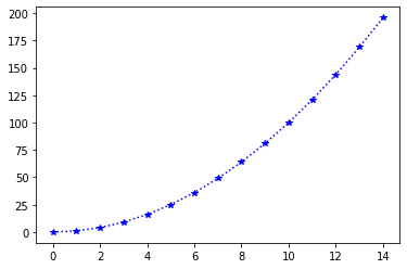
Line plot
import numpy as np
import matplotlib.pyplot as plt

fig, ax = plt.subplots()

x = np.arange(15)
y = x ** 2

ax.plot(
    x, y,
    linestyle=":",
    marker="*",
    color="blue"
)
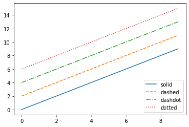
Line style
import numpy as np
import matplotlib.pyplot as plt

x = np.arange(10)

fig, ax = plt.subplots()

ax.plot(x, x, linestyle="-", label="solid")
ax.plot(x, x + 2, linestyle="--", label="dashed")
ax.plot(x, x + 4, linestyle="-.", label="dashdot")
ax.plot(x, x + 6, linestyle=":", label="dotted")

ax.legend(loc="lower right")
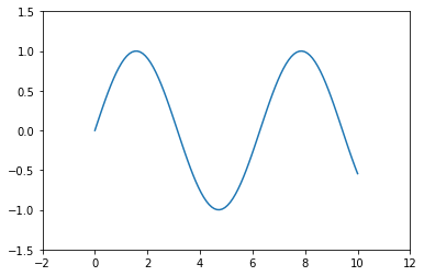
축 경계 조정하기
import numpy as np
import matplotlib.pyplot as plt

x = np.linspace(0, 10, 100)

fig, ax = plt.subplots()
ax.plot(x, np.sin(x))
ax.set_xlim(-2, 12)
ax.set_ylim(-1.5, 1.5)
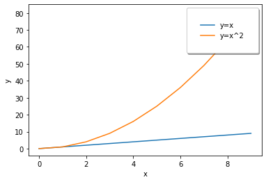
범례 (legend)
import numpy as np
import matplotlib.pyplot as plt

x = np.arange(10)

fig, ax = plt.subplots()
ax.plot(x, x, label='y=x')
ax.plot(x, x**2, label='y=x^2')
ax.set_xlabel("x")
ax.set_ylabel("y")
ax.legend(
    loc='upper right',
    shadow=True,
    fancybox=True,
    borderpad=2
)
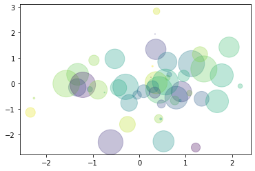
Scatter
import numpy as np
import matplotlib.pyplot as plt

x = np.random.randn(50)
y = np.random.randn(50)

colors = np.random.randint(0, 100, 50)
sizes = 500 * np.pi * np.random.rand(50) ** 2

fig, ax = plt.subplots()
ax.scatter(
    x, y,
    c = colors,
    s = sizes,
    alpha = 0.3
)
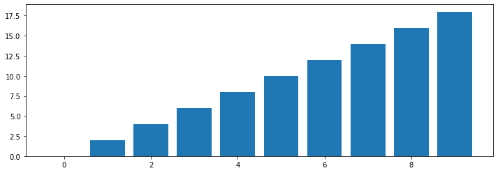
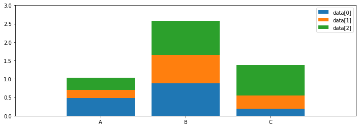
Bar
import numpy as np
import matplotlib.pyplot as plt

x = np.arange(10)

fig, ax = plt.subplots(figsize=(12, 4))
ax.bar(x, x*2)
import numpy as np
import matplotlib.pyplot as plt

x = np.random.rand(3)
y = np.random.rand(3)
z = np.random.rand(3)

data = [x, y, z]
fig, ax = plt.subplots(figsize=(12, 4))
x_ax= np.arange(3)

for i in x_ax:
    ax.bar(
        x_ax,
        data[i],
        bottom=np.sum(data[:i], axis=0),
        label = f"data[{i}]"
    )

ax.set_xticks(x_ax)
ax.set_xticklabels(["A", "B", "C"])
ax.set_xlim(-1, 3)
ax.set_ylim(0, 3)
ax.legend(loc="upper right")
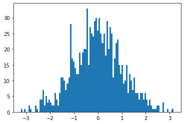
Histogram
import numpy as np
import matplotlib.pyplot as plt

fig, ax = plt.subplots()
data = np.random.randn(1000)

ax.hist(data, bins=100)
Leave a comment